
Japanese American Museum,
San Jose
A Rebranding

Jump Directly to:
Overview
This project sought to do a rebranding of an identity-based museum, and chose the Japanese American Museum of San Jose, with detailed focus on
-
Who their core audience is
-
What types of exhibits they typically curate
-
Their mission, purpose, and history.
The rebranding included redesigning the homepage and two other secondary pages of their website, redesigning the logo, and business inventory, based on research into the ethno-cultural history of Japanese American Museum.
Project Specifics:
Timeline: 7 weeks
Time period: July -August 2021
My role: Sole designer & researcher.
Tools Used: Adobe Illustrator, Adobe InDesign, Microsoft word, pencil & paper.

Original website of J A M

After the redesign
My chief guideline in this whole project was a quote by Walter Landor:
"Products are made in the factory. but brands are made in the mind."
Process
Conducting Background
Research
Define the audience
Define identity attributes
Clarify Strategy
Design brand touchpoints.
(Website, business inventory)
Background Research
Core Audience
By its own declaration, the museum states that its not focused on solely Japanese culture per se, but in the history and culture of the Japanese-American experience, more so in the Santa Clara valley. A museum squarely placed on Japanese-American identity is manifestly geared towards such an ethnic population that is interested to learn about their history, with its location being in an area known as “Japantown” in San Jose, the core audience consists of Japanese-Americans, as well as anyone interested in their history. That history is not just interesting, but sobering.
Exhibits
This museum showcases a unique collection of permanent and rotating exhibits chronicling more than a century of Japanese American history:
-
Delineating the early immigration of Japanese to America,
-
Their leadership in the agricultural community,
-
Their incarceration during World War II following a Presidential order,
-
Their resilience as they came out of it, and
-
The challenges they faced, while adapting and contributing to West Coast communities.
In addition, JAMsj provides and facilitates a historical forum stimulating present day discussions on civil liberties, race relations, discrimination, and American identity.
Mission, Purpose & History
On their website, the mission statement reads as follows:
“The mission of the Japanese American Museum of San Jose is to collect, preserve and share Japanese American History, Culture and Art with a focus on the Greater Bay Area.”
Further, JAMsj has an important focus of telling the history of the WWII Internment of Japanese Americans following a presidential area to concentration camps, to those unfamiliar with or new to that episode of history.
Its archival goals are clearly important, since the museum recognizes that an aging current volunteer workforce, who are often crucial in translating, locating, and maintaining archival documents, are becoming a decreasing pool.
The chosen color of the museum, as apparent from its logo, branding and merchandise is purple, a color that’s borne out of mixing red (symbolic of Japan, ‘The Land of the Rising Sun’, as well as the USA) and blue (one of the flag colors of the USA). It’s clear where this museum tries to anchor its identity.
History
JAMsj was established in the November of 1987, in growing out of a 1984-86 research project on Japanese American farmers in the Santa Clara Valley. The project was about collecting family histories, old historical photographs, private memories and other unpublished documents that found its way in the curriculum of several schools in Bay Area school districts.
From its formative stages thus far, the museum started in an upstairs room of the historic Issei Memorial Building, formerly the Kuwabara Hospital. The name change happened much later, in 2002, from Japanese American Resource Center/Museum (JARC/M) to Japanese American Museum of San Jose (JAMsj) to better reflect the museum's archival focus. The museum now occupies over 6400 square feet, enabling JAMsj to showcase their extensive collection of exhibits and educational programs open to the public.
Based on the background research, the 5 attributes of the Japanese American Museum identity could be depicted as follows:

Defining identity attributes
Clarifying the Strategy
The rebranding strategy started from researching into the purpose behind the museum, its history, and decided that certain core attributes has to be delivered in its branding message, those being:
-
Adaptability
-
Resilience
-
Unmistakable Japanese identity
-
A blended identity that's evolved with the unique sobering history of being Japanese-American.
Museum webpages should be focused on bringing engagement with audiences to know about the history of the Japanese-American people. In addition, the museum should highlight its archival assets and the power of storytelling in retelling history.
Symbols carry meanings which are crucial in interaction. Therefore, in designing interaction through touchpoints, I focused on what symbols could be carrying meaningful impacts in the rebranding of the Japanese American Museum.
Much of this exercise was the driving force behind developing the Logo.
Developing the Logo
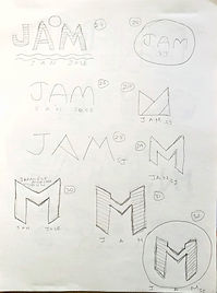
Initial Sketches had 50 different versions in trying to come up with a logo, based on:
-
Japanese-American identity and attributes of resilience, adaptability, agriculture,
-
Being in the Santa Clara valley and Bay Area, as well as,
-
Carrying hyphenated ethnic identities of being Japanese + American.
_JPG.jpg)
_JPG.jpg)
_JPG.jpg)
_JPG.jpg)

_JPG.jpg)
Hand Sketches of Logos
Developing the Typography & Logos
thought process
Developing the typeface was done with the perspective that letterforms and typefaces are culturally loaded objects -- they often carry the history and stories people want to tell, and a lot of typeface to use, is dependent also on the audience. There is a reflexive dialogue that happens through the use of typefaces, and that dialogue is very much dependent on who we are, and what are our stories.
Based on ethnic and cultural identities and the stories that we hold in our minds, I had decided on the following typographic palettes, in accordance with the logos:

01

I wanted the colors of red and blue forming purple, to be present in the logo. There's an origami style, which shows adaptability and resilience. The paper folds into 'M', standing for Museum.
The typefaces reflect the sleek everyday living in the Bay Area, while the second subheader typeface gives out a Japanese essence from its longish forms similar to Kanji characters.

02

The same colors of red, blue and white were focussed upon -- all colors being present in the American flag (and identity), and red also being the identity color of Japan. Origami can be made into so many different shapes and can be manipulated and changed, demonstrating adaptability.
The first typeface -- Lithos Pro Light -- reflect has a certain sharpness, as seen in calligraphy, as seen in bamboo leaves-- these being all part of cultural artifacts that holds the Japanese identity. The second typeface, --Futura Pt. Book -- signifies tradition.

03

I looked at original Kanji Characters and tried to find something that could work as parallels.
I know the middle character – A in English – means person or people in Kanji, and thought that could blend well with what the Museum stands for – telling the stories of Japanese migrant people who came to America and then adopted the experience of living in America and making it a part of their identity.
On the overall shape depicting a temple or shrine – I wanted to depict “sacred”. Memories or histories are sacred. A museum preserves memories, and this one, more so.
On the typefaces, I combined traditional (first typeface) with distinctive (second typeface -- Lithos Pro Light).
The second logo was finalized to be used in the rebranding process, because I wanted to focus on the attributes of resilience, adaptability and unique identity, and the origami form in the logo, I believe, depicts those attributes.

Color Palette
#404040
RGB 64, 64, 64
HSV 0,0, 25
CMYK 0, 0, 0, 75
LAB 27, 0, 0
#F2F2F2
RGB 242, 242, 242
HSV 0, 0, 95
CMYK 0, 0, 0, 5
LAB 95, 0, 0
#BF1B39
RGB 191, 27, 57
HSV 349, 86, 75
CMYK 0, 86, 70, 25
LAB 41, 62, 27
#F2C029
RGB 242, 192, 41
HSV 45, 83, 95
CMYK 0, 21, 83, 5
LAB 80, 5, 75
#270B8C
RGB 39,11, 140
HSV 253, 92, 55
CMYK 72, 92, 0, 45
LAB 18, 48, 64.
Accessibility:
Passes the Contrast Ratio of AA and AAA Guidelines, having a contrast ratio of 10.37 : 1.
Is color blind safe.
Business Inventory

Business Card

Envelope

Letterhead
Website Redesigned
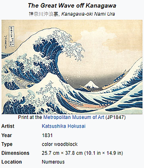
The web screens were designed keeping in mind visual design principles, employing Gestalt Psychology/Theory and subtle hints of Japanese identity markers such as the painting "The Great Wave of Kanagawa", layered through red and blue colors forming purple, since Japanese-American identity is a blended, evolved process.
Buttons were highlighted such that the audience are encouraged to visit the Museum, and in such a process, web screens sought to give the user a clean, intuitive and easy navigating experience.

Home Page

About Page

Gallery Page
Next Steps
The web screens were made to attribute greater visual hierarchy and a comprehensive branding
throughout. After converting a few more screens based on same visual design principles, usability studies would help establish functionality of the redesign and take iterative steps based on test results.